Restless Symmetries brings together two artists of differing backgrounds who share common ground in their art. For Barbara Strigel, her images are a visual essay on the nature of our perception of cities. For Kelda Van Patten, her work is in the style of a not-so-classic still life with visual reference to our internal environment and our inner selves inspired by selected poetry. Both artists exhibit a common energy in their work: a certain anxiety, pleasure, restlessness and motion. One exhibits symmetry in architecture from various countries; and the other a correspondence between symbolism embedded in both words and images. What appear to be disparate works come together in Restless Symmetries.
There is a symmetry that exists between the artists, themselves. They share a common geography. One is an American living in Vancouver on the Western side of Canada, and the other from Oregon, in the Northwestern United States. Both have taught art to others. Their works are metaphorical in using these visual compositions to represent something else and suggest interpretations and comparisons. Both reference the influence of specific poets. The art is photography-based using their own photo imagery, cut and torn paper, scanned images, collage, and physically drawn interventions onto the image with marker, paint, brush strokes, and pencil. Each image incorporates a studied expression and use of light, color and shapes. The work is, at the same time, analog and digital. While the artwork is editioned, the physical intervention makes each work, in a sense, unique.
Collage, a technique both artists use, has a rich place deep in art history. The word “collage,” from the French verb coller, meaning “to stick,” was first used to describe the Cubist innovations of Pablo Picasso and Georges Braque, who began to stick newspaper cuttings and other materials onto their canvases in 1912 according to a comment in “Stick ‘em Up! A Surprising History of Collage (7/24/2019)” from The Economist. During the Dada and Surrealist movements in the 1920’s and later, Hannah Höch used collage as part of photomontage, an art form she helped to pioneer.
Barbara Strigel uses her urban/street photography to convey the sense of being "alone together" in urban life. In much of Strigel’s work, she features shadow-like images of people in motion. For the body of work entitled “We Were Neither Here nor There,” she comments: “There's a certain gestalt in the balance of connection and separation that occurs in cities. We go about our business, sharing the sidewalk but lost in our own thoughts… For me, street photography and collage are both a search for unity. ” Another set of her images is titled “If We Were to Talk about Architecture.” Here, she comments: “In the shape of the city, there are instances when architecture becomes an entry point. The shadow of leaves on a blue wall becomes a recollection of summer, telephone wires sing jazz, and a repetition of square windows evoke a meditation. These fragmentary moments are resonant, sensory perceptions that invite connection to space.” In Strigel’s imagery, there is a simultaneous sense of the intangible connection with others in cities, and a sense of common ground and shared existence as we go about our lives in the same urban environment which, in a very real sense, holds and contains us.
Her works are interpretations of the idea of the city, and as such often combine imagery of multiple cities. The images are captured from a life that is very international. Her husband is German, and her first husband was Iranian. In addition to the United States and Canada, she has traveled to Germany, Turkey, Italy, Iran, Croatia, Cambodia, Japan, Mexico, Bonaire, Czech Republic, Hungary, France, Spain, Portugal, Greece, and Austria. What she photographs and how she uses that imagery depends on what aspect of those cities move her and how she reacts to being there. Why are there multiple locations in her collages? Strigel answers, “I am often working with photographs from my travel archive. As a traveller, I am interested in the character of particular places, but these collages are not about specific locations. Instead, they explore the idea that a city is a perception, shaped by individual associations and experiences. When I moved to Vancouver after decades of living in the suburbs, I was enthralled to be living in a city again. I found rhythm in the alley's telephone wires and a sense of containment in the way the mountains and sea surrounded the periphery. There were old hotels that reminded me of an Edward Hopper painting and walls in Chinatown that evoked another era. I felt a part of something outside of myself when I stood beside strangers waiting for the bus. My notion of this city was shaped by my history of reading about other cities, by movies I'd seen and the poetry of Frank O'Hara and the collages of Romare Bearden. It's the idea of an analogous city, one that takes its shape from collective memory. When I construct these collages, I work with fragments of my photographs. I layer them, positioning and arranging until something resonant begins to appear, and then I work to unify the pieces into an evocative familiar space. I want my collages to remind the viewer of the way a place appears in recollection.”
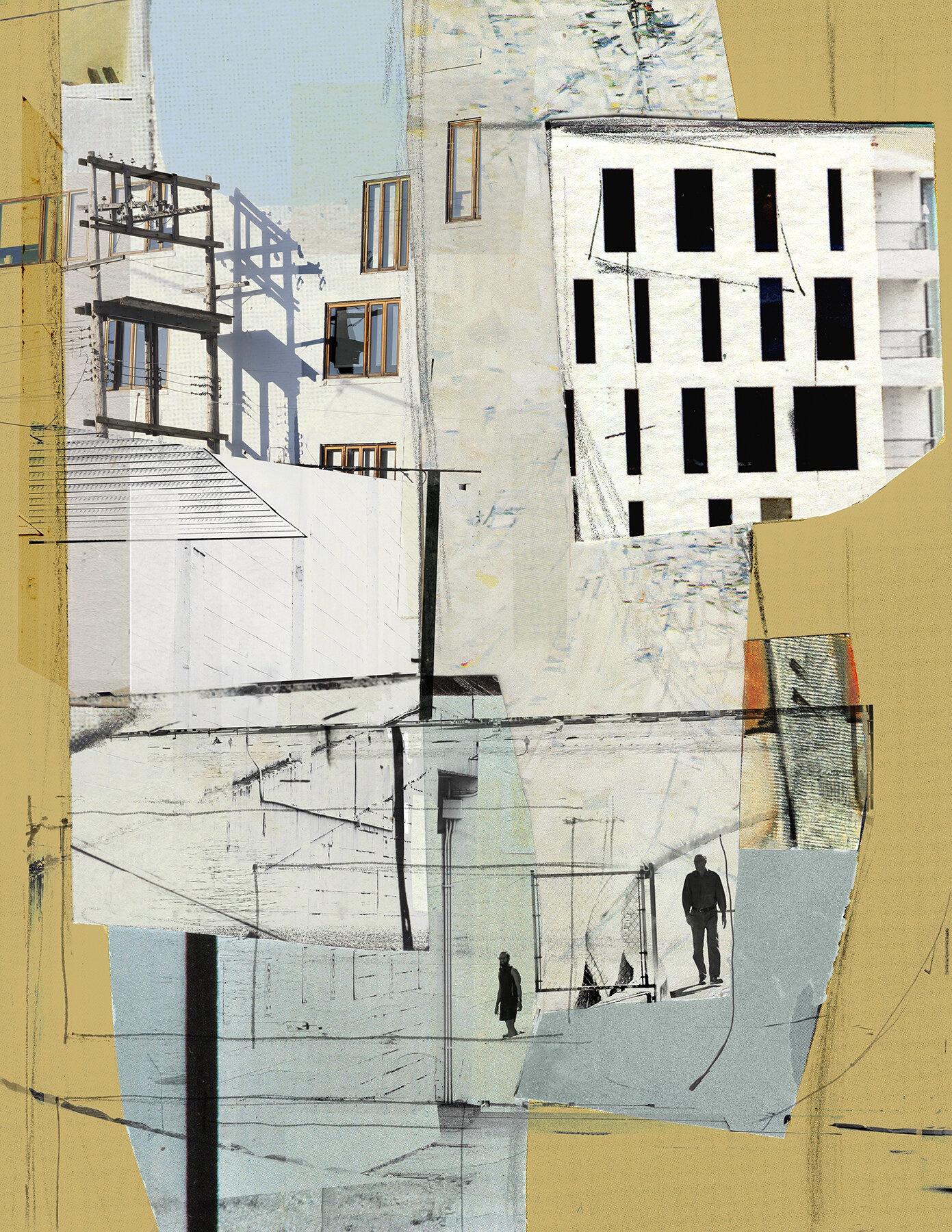
“In Recalling a City" 2021, from the series “If We Were to Talk about Architecture” by Barbara Strigel
With the image “In Recalling A City,” the visuals are sourced from her home city of Vancouver, and also from Tokyo. Each of her images from the series “If We Were to Talk about Architecture” present a familiar but unexpected view. In this case, a view from the periphery along an expansive edge. We see individuals at a gate, the implied entry. A neutral color palette of whites, grays, and a golden border. The overall muted colors convey a positive sense of pace and positive tone, with blue sky above the buildings. We see sharp shadows that define a clear sky, as there are no clouds visible and the shadows are sharp. Some of the windows are absolute black, suggesting that light goes into the building, but the image will not reveal to us what is within. There is a structure that looks like it once held an advertising billboard no longer visible, to remove abusing the viewer with the onslaught of commercial messages that flood over us in any city we visit. Strigel is allowing us a more quiet, serene, and pleasant invitation to experience the architecture she has selected in this and each of these images. We see outlines of roofs, and lines that are, or resemble, wires that crisscross around the image. This again reminds us that in many cities our upward, overhead views are thatched with electrical and telephone wires of all shapes, dimensions, assembly, and intersection.
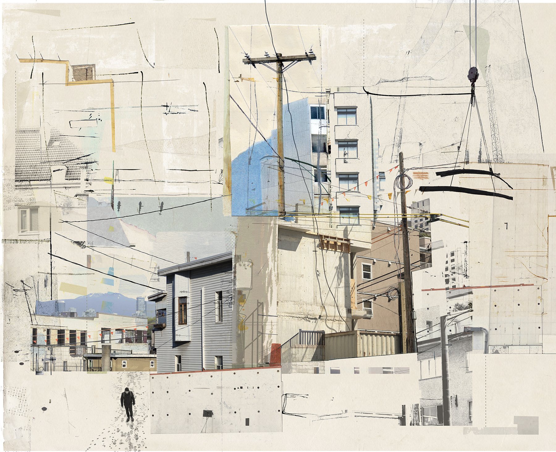
“Reading Architecture" 2022, from the series “If We Were to Talk about Architecture” by Barbara Strigel
In another image, “Reading Architecture,” we are invited to urban living, with a broad palette of building facades that look mostly residential. Photographed in Vancouver, there is, in Strigel’s words, a “rhythm of lines, movement and respite, the presence of mountains.” In the image “In Recalling A City,” Strigel uses color to frame the image and contain the viewer to the central space, while here, the viewer’s eyes are allowed to wander more freely across the space. On the right we see a construction crane lifting girders to remind us that a city is anything but static. This visual also triggers a recall of the noise we experience in any city environment. In the upper center area is a telephone pole with presumably an office-like build behind it. It reminds us of the constant stream of communication, with land-lines and cellular data that is flowing all around us - visibly and invisibly. And, as with “In Recalling a City,” she provides a gridding of wires all across the image in random directions and arrangements, almost wrapping the image, and us, as if caught in a spider web. On the upper left, as we roll through and around the image, we see the outline of what appears to be a clay tiled roof and a partly open casement style window. Interestingly, this is a more residential type building than we might sense with the other structures in the image. The arrangement of the buildings breaks up the plane of the print to give us a sense of depth, with buildings falling away to the left and right. The color palette is neutral and comfortable, again with pleasing blues, tans, and light grays in the center.
Strigel uses darkened figures, in apparent motion, as guides for the viewer into, and out of, the image. In the lower left is a lone individual who appears to be trudging through snow, where we also see a massive pattern of footsteps of others who have trudged that same path before. This person, in all black with a black cap appears to be wearing a backpack, perhaps indicating his commute to to from work. Since he is walking toward the viewer and away from the buildings, we may assume this is the end of his day. He also appears dressed as a worker, but not a traditional office dweller, as they are not wearing a suit and tie as best we can tell.
What we find in common with all of Strigel’s images in this exhibition is the generous visual gift of space, despite the sense of urban living. There is an airiness to her work, that invites rather than overwhelms, that gives us room to breathe rather than feel claustrophobic and hemmed in, surrounded by stifling huge concrete and iron monoliths. With her use of patches of color, we are given a sense of festivity rather than confrontation with the drab, dirty, white colored sidewalks and unexciting colors of most buildings, and the lack of green spaces that offer what natural color a city might have beyond flashing neon signs, billboards and a blue sky, if we can see the sky through the smoke and smog. Notably, Strigel has not highlighted some of the exciting newer architectural structures popping up in these cities. In these images, the buildings carry more a sense of the historic and the traditional.
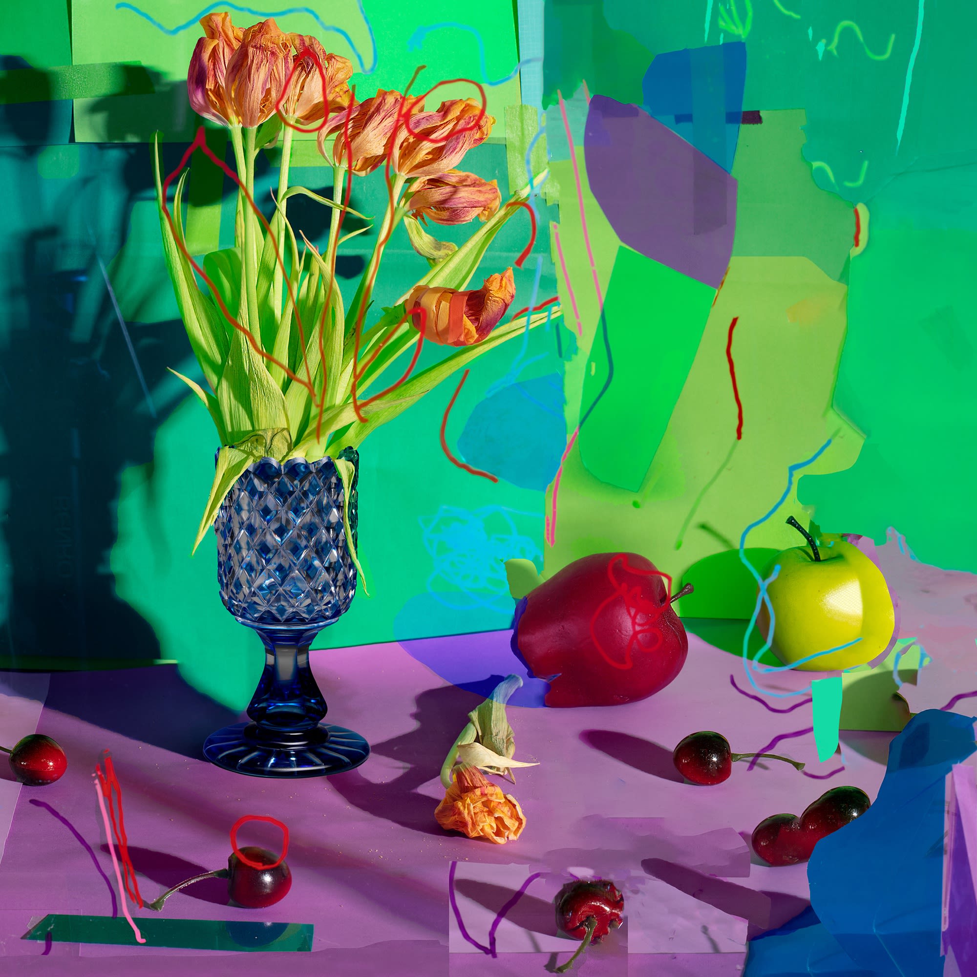
“The table laid before a party, the unperceived and therefore never felt and seldom expressed; the funeral silence of bones beneath the green carpet of evenly cut grass (the sadness of green, after Mary Ruefle)" 2021, from the series “Always in Flower and in Fruit” by Kelda Van Patten
At first glance, Kelda Van Patten’s images appear very distinct from those of Barbara Strigel. Van Patten speaks about influences on her art: “So many artists and art movements have influenced me, from 17th century Dutch still life painting to the 1980’s Pictures Generation. I love the collage work of dada artist Hannah Höch, the use of color in Matisse’s still life paintings, the smart sculptural installations of Sarah Sze, and, of course, I am super excited about what is happening in contemporary photography today; I especially admire artists such as Lucas Blalock, Daniel Gordon, and Sara Cwynar. Charlotte Cotton, in her book, Photography is Magic, really speaks so eloquently to the current generations of photographers between Generation Z and Gen X, who are interested in constructed photography and contemporary image culture.”
Van Patten then addresses her own work in this excerpt from her artist statement: “I seek to invoke a sense of surprise or contradiction through the consideration of photographs that occupy liminal spaces between artifice and truth, imagination and the real, and mimesis and the origin. The subjects that I photograph are mined from the natural world and kitsch… For example, I think of artificial flowers, fruit, and plants as kitsch objects that attempt to mimic the blooming beauty of nature, while virtually eliminating the process of decay from the natural world… My printed photographs are often cut and taped to the wall and rephotographed. In that sense, my work embodies the natural cycles of change: perpetually unfolding, and in a permanent state of suspense.”
Her photographs have a certain attraction and beauty, so it may seem odd for Van Patten to use the word “Kitsch” to describe them. The term Kitsch, as used to describe art, or an item, is considered to be an object in poor taste, but sometimes appreciated in a knowing way, like artificial flowers in place of living ones. Van Patten considers kitsch in a broader sense, and seeks to reference that world, rather than create images which are kitsch themselves. Inspired by the poetry of Mary Ruefle, Van Patten’s images hold a deeper reflection on how we live. We can better understand Van Patten by looking at two of her images: “Fruit of the Loom/Womb,” 2020, and “The table laid before a party, the unperceived and therefore never felt and seldom expressed; the funeral silence of bones beneath the green carpet of evenly cut grass (the sadness of green, after Mary Ruefle),” 2021.
Kelda Van Patten views her titles as much a part of the image as what is cut and pasted into the work. She layers in meaning both in the construction of her images andin the titling of her works. “The titles of my work are an integral part of the piece itself; I think of them as another layer of collage. They are often short phrases that integrate found language appropriated from poetry or prose. Of particular influence is the poet, Mary Ruefle. In her book, My Private Property, she intersperses short, visually vivid prose that describes the sadness of certain colors. I reference these often, and feel that the words are in collaboration with the shades of color used in my work, particularly in the series, Always in Flower and in Fruit.”
In “The table laid before a party, the unperceived and therefore never felt and seldom expressed; the funeral silence of bones beneath the green carpet of evenly cut grass (the sadness of green, after Mary Ruefle),” 2021, Van Patten leans on the poetry of Mary Ruefle. The following excerpt is written by Mary Ruefle, and Kelda incorporates portions of this in the image title: “Green sadness is sadness dressed for graduation, it is the sadness of June, of shiny toasters as they come out of their boxes, the table laid before a party, the smell of new strawberries and dripping roasts about to be devoured; it is the sadness of the unperceived and therefore never felt and seldom expressed, except on occasion by polka dancers and little girls who, in imitation of their grandmothers, decide who shall have their bunny when they die. Green sadness weighs no more than an unused handkerchief, it is the funeral silence of bones beneath the green carpet of evenly cut grass upon which the bride and groom walk in joy.”
In looking at the image, we see a green background wall and a purplish tablecloth. On it is a vase of dying flowers, a red and a green apple, and deep red cherries. There is a sharp shadow on the left wall behind the vase from a direct light placed somewhere to the right outside of the image. Seemingly random lines of various colors are drawn on the surface of the image, appearing as if on a different plane from the still life image that lies in a space behind the squiggles. The image evokes melancholy, that feeling of sadness, yet, as Ruefle seems to write, a hopefulness that comes from the seeing the color green and the sensation it elicits. The work symbolizes the inevitable cycle of life, birth, death, and renewal.
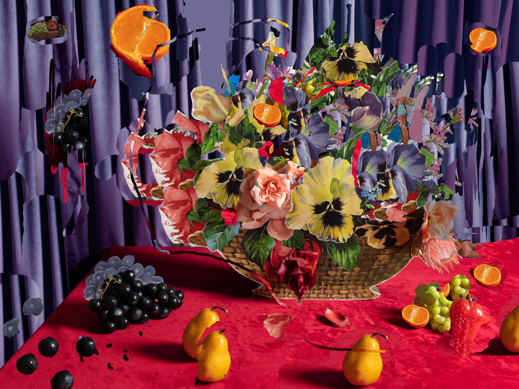
“Fruit of the Loom/Womb” 2020, from the series Dining Room Pictures by Kelda Van Patten
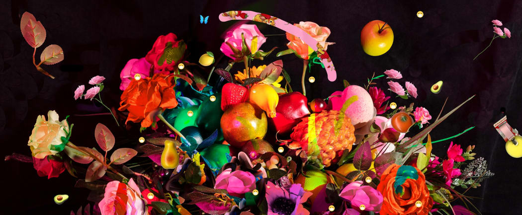
“Fruit of the Loom / Womb” has a shorter, yet no less evocative, title. Looking at the image, we see a purple background and a red tablecloth. On the table is a basket (or, rather, a photograph of a Victorian die-cut of a basket) of many flowers, primarily pansies, surrounded above and on the tabletop by actual, artificial, and illustrated fruits - dark black and green grapes, pears, and split oranges. The classic Fruit of the Loom logo can be spotted in the top left corner, and images of feminine bodies wearing only undergarments are camouflaged into the florals.
In her own words, Van Patten is both celebrating and critiquing how fruit and flowers are often used as a reference or substitution for the female and female identifying body in Western culture. As in much of her work, she subverts the stereotypically feminine imagery by cutting, tearing, folding, taping, piling, spilling, and using photoshop in ways that expose rather than conceal. She reveals mistakes and imperfections rather than covering them up, in direct conflict with the long-standing tradition in advertising of concealing and touching up. According to Van Patten, The Fruit of the Loom logo, as well as the mostly nude female figures, are cut out of a 1980’s advertisement for underwear, in which the tagline was “Nothing feels as natural.” She spoke about the missing context of the original ad, stating that the models were posed in less-than-natural positions next to lavish baskets of ripe fruit. Here, she draws a direct reference to the female bodies being contextualized as fertile and ripe in mainstream advertising.
To help appreciate the symbolism through color in this image, we once again reference the poet Ruefle. For the color purple, Ruefle wrote: “Purple sadness is the sadness of classical music and eggplant, the stroke of midnight, human organs, ports cut off for part of every year, words with too many meanings, incense, insomnia, and the crescent moon. It is the sadness of play money, and icebergs seen from a canoe. It is possible to dance to purple sadness, though slowly, as slowly as it takes to dig a pit to hold a sleeping giant. Purple sadness is pervasive, and goes deeper into the interior than the world’s greatest nickel deposits, or any other sadness on earth. It is the sadness of depositories, and heels echoing down a long corridor, it is the sound of your mother closing the door at night, leaving you alone.”
For the color Red, Ruefle wrote: “Red sadness is the secret one. Red sadness never appears sad, it appears as Nijinsky bolting across the stage in mid-air, it appears in flashes of passion, anger, fear, inspiration, and courage, in dark unsellable visions; it is an upside-down penny concealed beneath a tea cozy, the even-tempered and steady-minded are not exempt from it, and a curator once attached this tag to it: Because of the fragile nature of the pouch no attempt has been made to extract the note."
So what might we read or think about these two colors placed in the composition abutting each other? Ruefle writes that with purple, one cannot dance. “It is possible to dance to purple sadness, though slowly, as slowly as it takes to dig a pit to hold a sleeping giant.” Yet, with Red, Ruefle references a famous Polish dancer and choreographer, Nijinsky, who is “bolting across the stage in mid-air, it appears in flashes of passion, anger, fear, inspiration, and courage, in dark unsellable visions…”
But then there is the fruit flying/floating throughout the image. What does a Pear represent? From the website thepresenttree.com, there is this interpretation: “In many cultures spanning thousands of years, we can find references to the fruit of the Pear tree as a symbol of divine sustenance, abundance and longevity. The shape of the pear has represented the female form in the art world for centuries, creating a strong symbol of fruitfulness and femininity.” And grapes: “Mature grapes in paintings, like their religious symbolism, represent youthfulness, vitality, abundance and fertility.” according to symbolsage.com. For oranges: “Spiritual interpretations of oranges often revolve around wealth, prosperity, progress, and true love” from symbolismandmetaphor.com.
We are left with many clues and no definitive answer. The artist leaves us on our own to take these clues and formulate our own interpretation. One can find layered symbolism in Van Patten’s work the same as other works that were influenced by the old Dutch master works. An interpretation of such imagery was the subject of one of our earlier Commentaries (See the Commentary “Fabled Flora” on the Still Life genre in photography-based works -- https://fotorelevance.com/blog/30-still-life-stories-fabled-flora-by-geoffrey-c.-koslov/).
One must appreciate art that demands to be studied. Both of these artists, Barbara Strigel and Kelda Van Patten, put us in a position where we must pause and think critically about an image. We cannot just merely look. Between and within this collection of scenes are multiple layers of restless symmetry. These images bookend our external living within cities with the sanctuary of our internal environment, represented with a still-life-like style. Barbara Strigel’s works remind us of the external world we live in as diverse and constructed. Kelda Van Patten reminds us to pay attention to our innermost personal thoughts and feelings. But this is what art is supposed to do for and to us. Nothing about these works or these artists is passive. Strigel and Van Patten’s works make us restless. They offer us, the viewer, symmetry, each providing a window through which to evaluate a place, and doors that open us to thought and reflection.

